You’ve Either Shipped or You Haven’t

scraplab — You’ve Either Shipped or You Haven’t (via waxy)

You’ve either shipped, or you haven’t. You’ve either poured weeks, months or even years of your life into bringing a product or a service into the world, or you haven’t.

But whatever you do next, you’ve shipped. You’ve joined the club.

And the next time someone produces an antenna with a weak spot, or a sticky accelerator, you’re more likely to feel their pain, listen to their words and trust their actions than the braying media who have never shipped anything in their lives.

Performance Comparison of Image Libraries

For the past couple years, I’ve been using the Python CoreGraphics bindings to do some of my image manipulation. While a bit more complex than I would have liked for setup (dealing w/ context rotations and other scaling math was a bit of the pain), it otherwise worked great (and more importantly, right out of the box) on Leopard. Unfortunately, with Snow Leopard, the CoreGraphics library was unceremoniously (as far as I know, without any sort of announcement or acknowledgement) deprecated. It’d only work in 32-bit mode and more troubling, certain Context calls that used to take floats now required CGFloats. Not so much of a problem… besides the fact that even after much research and poking, I found no way to instantiate a CGFloat (there’s an undocumented CGFloatArray call, but that just gives you uninitialized CGFloats w/o a good way to assign them).

As has been the trend, I’ve been isolating/switching more and more of my code from anything that touches Apple libraries. I’ve come to the conclusion that they just don’t give a shit about breaking your code (much less care about fixing or even responding what they’ve broken). It’s incredibly off-putting. In this case, it’s unfortunate, as the CoreGraphics code performs much better than both PIL and ImageMagick (I would have tested GraphicsMagick as well, but it doesn’t support the chaining features I needed for my particular resizing/layout operations).

CoreGraphics Python w/ kCGInterpolationHigh
real     0m1.885s
user     0m1.456s
sys      0m0.400s

PIL w/ Bilinear Filter Resize
real     0m3.380s
user     0m2.981s
sys      0m0.365s

32-bit Static ImageMagick
real     0m7.125s
user     0m9.730s
sys      0m0.652s

32-bit Static ImageMagick w/ Box Filter Resize
real     0m4.237s
user     0m4.438s
sys      0m0.636s

64-bit Shared ImageMagick
real     0m6.080s
user     0m8.495s
sys      0m0.366s

64-bit Shared ImageMagick w/ Box Filter Resize
real     0m3.268s
user     0m3.599s
sys      0m0.331s

A few things worth noting:

  • I try to use the system Python. After all the problems w/ 10.5->10.6 though, I am reconsidering.
  • PIL seemed to easy_install well (w/ a binary egg no less) on my 10.6 – I’ll have to test on a clean system to make sure I hadn’t made my life easier w/ MacPorts or something, but this is a huge improvement over the problems surrounding installing PIL on 10.5, which was what actually drove me to use the CoreGraphics Python library in the first place. UPDATE: on a clean 10.6 install, it compiles, but doesn’t have JPEG or FreeType support. waah wahhh
  • ImageMagick defaults to Lanczos filtering by default, which is quite slow. Testing out various filters, Box filtering was about twice as fast and for my test images had neglible-to-nonexistent image quality differences even under the loupe. Definitely worth poking around a bit if you’re trying to get better performance.
  • The 64-bit shared lib version of ImageMagick is fair bit faster than the 32-bit static version. Until I’m all on 64-bit hardware, is a bit of a moot point to do further testing though. I’m assuming the extra sys time is due to the staticness and the remainder is due to 64-bitness.
  • Given roughly equivalent performance between PIL and ImageMagick, I’ll be going with ImageMagick for the additional flexibility/features it provides.
  • Although it doesn’t work for this particular set of operations, I wanted to mention that Marc Lyniage’s CoreImageTool is just a wicked, wicked piece of software. It of course has all the CoreImage caveats though, especially if you have to deal with Intel’s crappy GPUs (*fist shaking*)

KIN Lessons

There’s been a lot of recent reporting on the complete failure of the KIN (and Microsoft in general). Of these, I think that this comment from a Danger employee posted on Mini-Microsoft both sums things up, and serves as an object lesson for anyone in tech, and is worth reposting in full:

To the person who talked about the unprofessional behavior of the Palo Alto Kin (former Danger team), I need to respond because I was one of them.

You are correct, the remaining Danger team was not professional nor did we show off the amazing stuff we had that made Danger such a great place. But the reason for that was our collective disbelief that we were working in such a screwed up place. Yes, we took long lunches and we sat in conference rooms and went on coffee breaks and the conversations always went something like this…”Can you believe that want us to do this?” Or “Did you hear that IM was cut, YouTube was cut? The App store was cut?” “Can you believe how mismanaged this place is?” “Why is this place to dysfunctional??”

Please understand that we went from being a high functioning, extremely passionate and driven organization to a dysfunctional organization where decisions were made by politics rather than logic.

Consider this, in less than 10 years with 1/10 of the budget Microsoft had for PMX, we created a fully multitasking operating system, a powerful service to support it, 12 different device models, and obsessed and supportive fans of our product. While I will grant that we did not shake up the entire wireless world (ala iPhone) we made a really good product and were rewarded by the incredible support of our userbase and our own feelings of accomplishment. If we had had more time and resources, we would of come out with newer versions, supporting touch screens and revamping our UI. But we ran out of time and were acquired and look at the results. A phone that was a complete and total failure. We all knew (Microsoft employees included) that is was a lackluster device, lacked the features the market wanted and was buggy with performance problems on top of it all.

When we were first acquired, we were not taking long lunches and coffee breaks. We were committed to help this Pink project out and show our stuff. But when our best ideas were knocked down over and over and it began to dawn on us that we were not going to have any real affect on the product, we gave up. We began counting down to the 2 year point so we could get our retention bonuses and get out.

I am sorry you had to witness that amazing group behave so poorly. Trust me, they were (and still are) the best group of people ever assembled to fight the cellular battle. But when the leaders are all incompetent, we just wanted out.

(On another note, every time I read the minimsft comments, I just can’t get over how fucked MSFT’s corporate culture is. There’s just so much wrong on every level, it’d pretty much be impossible to succeed.)

And an interesting follow-up comment from another insider on project particulars:

Microsoft is a large enough company that experience in one part of it may not be applicable to other parts. (Duh). In PMX, there was no backstabbing or people out to get people. There was only poor management, a poorly designed and implemented product, and an insane delivery schedule.

Some random thoughts:

PMX was said to be a risky project. You don’t fire people who fail at risky projects, because if you do, eventually nobody will be willing to take a risk. Nobody will get fired and whatever accountability there is will happen behind closed doors.

PMX was very poorly run. One HR manager involved with the Danger onboarding actually described the failure as a ‘cluster f***’. Danger was lied to about the reason for the purchase and that set the tone of the relationship between ex-Danger people and PMX. It would only get worse as the project continued. The onboarding was typical of the quality of management. The MS-Poll results, some of the worst on record, were accurate, even though they were written off as “influenced by disgruntled Danger people.”

The Verizon deal was made by business development folk before engineering had been consulted. There was no way a phone capable of selling in the marketplace could have been developed using Microsoft software management process in the time frame.

In addition, between inception and delivery, the market place changed dramatically but Microsoft was unable to move agilely enough to compensate.

The phone should never have gone to market. It is too poorly designed, too buggy, too incomplete, and too overpriced. When Microsoft became aware of the data plan pricing that Verizon proposed, the project should have been cancelled, saving a couple hundred million in development and advertising.

It did sell more than 500, but I doubt anyone is going to argue against the Wall Street Journal assessment that it sold fewer than 10,000.

The number ‘2 billion’ is floating around as an estimate of the cost of PMX over its life. That number is too high, but ‘1 billion’ is too low.

The Future of Leonard’s Computing

For the past few months I’ve been meaning to put some of my thoughts down about what I’m looking forward to in my next computing device. My needs are somewhat specific, and influenced by the fact that I type a lot, I stare at screens all day, and for almost a year now, have been semi-nomadic.

My primary computing device (and what I’m typing on right now) for the past couple years is a 13″ 2008 Aluminum Unibody MacBook. This is about the longest I’ve had a laptop in the past decade. In between, I’ve had an incarnation of just about every generation of PowerBook/Macbook (Pro) since the earliest Titanium G4s (I may even have some of these still in storage). It has a few niggles (fidgety headphone jack, bad magnetic latch, non-backlit keys), but on the whole this MacBook is the best-built laptop I’ve ever owned – and even two years later, the unibody construction still impresses me as much as the day it arrived. Also, with 4GB of RAM and after putting in an SSD last year, I can honestly say that I feel no need for anything more powerful for my daily use. That being said, I’ve become increasingly frustrated with my Mac. Over the years, it’s become too big and heavy, less portable (especially for use outside and on the go), and the battery life, much too short (even after buying a brand new battery last week).

A lot of these frustrations are probably magnified because of the other devices that I’m now carrying around. In my bag now, I have a Kindle, and iPad 3G, an HTC EVO, an iPhone 3G, and (for a little bit) a Nokia N900. None of these are laptop replacements, but all of them point to the future in a way that my MacBook doesn’t.

Of course, the most talked about of these is the iPad. I don’t think I have much to add to that well trodden ground. I’ll just preface by saying that I’m not a hater. The iPad is not only a great lean back device, but it’s also a valid, and pretty darn compelling vision of the future of personal computing (except for the syncing w/ iTunes part. That’s just archaic). For most people, it lets them do everything they would want to do with a computer easier, better, and more socially. (My personal favorite commentaries on the iPad include Alex Payne’s and Fred Wilson‘s.) So, with that being said, although I’m now carrying one around (thanks Music Hack Day!), and I’ve poked and prodded extensively (see project here), it’s not the future of my computing.

For me, the laptop replacement I’m looking for is the smartbook. For those unfamiliar with the term, the simple description is that these are ARM-based smarphone guts stuffed into a netbook form factor. They are fanless, have 10″ screens, full-size keyboards and hover just under 2 lbs (800-900g) in weight. More importantly, they have ridiculous battery life (8-12hrs actual), days of standby, and like smartphones have 3G, GPS, quick wakeup and active-network standby. They are all Linux-based (Android or Meego), and provide a decent browser, vim, terminal, and keyboard – the things I actually need to stop carrying my laptop around.

Unfortunately, with all the tablet excitement, the smartbook form factor seems to have taken a bit of a backseat. Although prototypes have been shown by ODMs since Computex 2009, the only smartbook that has been released so far is the HP Compaq Airlife 100, and even then, only in Spain via Telefonica. Devices like the Mobinova Beam and Lenovo Skylight both have been delayed (without solid release dates) as they’ve been retooled to run Android, and ODM designs from Compal, Pegatron, Quanta etc have yet to show up anywhere besides the occasional trade show appearance.

Right now, the most promising up and coming smartbook looks to be the Toshiba AC100/Dynabook AZ. It’s scheduled to launch in August, and has gotten some fairly detailed hands-on reviews. Here’s the German English promo video that gives a decent overview:

The last piece of the puzzle for me, one that’s actually referenced (but not addressed) by the video above, is that my next computer should really be daylight readable. After some production delays, Pixel Qi (Mary Lou Jepsen‘s company spun off from the display technology she originally designed for the OLPC) has finally started selling its displays in kit form. Here is a video showing the Pixel Qi display compared to the iPad display outdoors:

And here’s a description of how the technology works:

There are other daylight readable technologies, CPT’s transflective display, Qualcomm’s Mirasol displays, and Liquavista’s electrowetting-based displays, but none of those have release dates yet. The Mirasol and Liquavista displays are very interesting, being color and bi-stable, but they’re currently being targeted primarily at e-book form factors/applications, so probably won’t be showing up in 10″+ screens anytime soon.

Qualcomm seems to be making good progress in releasing 5.7″ Mirasol-based e-readers by the end of the year, which would be darn nifty. Still, I won’t be holding my breath.

For those of you interested in following along, especially in the whole whole slightly weird world covering MIDs, tablets, and ultraportables, I recommend:

And, to sum up, there’s no product in the pipeline with quite these specs, but here’s what would make me a happy camper:

  • Good keyboard (Acer’s flat keys are my current favorite of the netbooks I’ve tried) w/ backlit keys
  • Large, multitouch trackpad
  • 8-12hrs of active battery life, several days standby
  • 2 lb weight, 0.5″ thickness
  • 10-12″ 720p+ daylight-readable screen (capacitive touch bonus)
  • GPS + Location aware OS
  • 3G WWAN (penta/hexband for bonus points)
  • Active network standby, notifications
  • Fast boot, instant resume
  • DisplayPort or HDMI output

Evo: Initial Thoughts

I’ve spent about a week living with the HTC EVO 4G, so I figured I’d write down my initial impressions. First of all, on the whole, I’m pretty happy with the phone although there are some rough edges. The physical device is pretty solid and it’s quite capable. It’s definitely good enough (and in some cases, best of class) for day to day use. I’m also having a lot of fun poking around with it, although in some cases I find that I’m able to push things too far.

Second, before proceeding, I’ll also mention that the iPhone 4 looks great. The industrial design and overall capabilities are impressive and I believe that overall, it edges out the EVO. While I’m less enamored w/ iOS these days, iOS 4 both adds some much needed capabilities (fast task switching, backgrounding for specific services) and maintains a huge lead over the competition in terms of polish and “just workingness.” That being said, I’ve been digging Android a lot more these days. It’s amazing how far it’s come in a year. It’s definitely crossed the “actually usable” bar and it’s strengths are really coming into play. Most notably: a great security model and APIs with full access to the system allowing developers to create a much larger variety of interesting and unique apps, and its web-native paradigm (syncing to the cloud instead of the being forced to plug into a USB port and a desktop application).

Now, onto some observations. First a look at the hardware/form factor:

  • The phone feels super solid. It’s got a good heft to it, but spread over a larger area, it’s not too bad.
  • The size of the device is, of course, big, but because it’s relatively thin, it feels pretty good in my hands, so no real complaints there.
  • There’s only 2 physical buttons: a power button on the top, and volume rocker. Both have good actuation and and very little play. I’ve noticed that when turning on the device initially, the power button is a bit fussy, but for waking up, it’s fine (well, the location could be a bit better, finger feel-wise, I have to hunt a bit even after a week). Because the buttons don’t give, I am running an app called No Lock that both gets rid of the lock screen and allows me to use the volume buttons to wake the phone.
  • There’s a charging LED on the left side of the top speaker, but it doesn’t seem to be used for notifications (?). Rather, an LED lights up the bottom row of capacitive screens, which is pretty neat.
  • The camera is pretty good in decent lighting. I may be convinced to carry around a macro lens
  • The capacitive button row on the are sometimes overly sensitive – I seem to accidentally trigger something fairly often. I don’t know if this is related to my specific phone
  • While the build quality overall feels good (no creaks, etc), I’ve noticed (as have some others) that there’s some backlight bleed at the bottom – which in my unit is actually accompanied by some flex on the bottom corners of my unit. They’re actually very slightly elevated (not flush) with the edge and seem like they’re “popping out”, for lack of a better described. I may be annoyed enough to check if this is normal and if not, exchange it soon.
  • Update: an additional caveat is that apparently, like the Incredible, the EVO touchscreen is improperly grounded. This means if you are only touching the screen (say putting it on a table or dock w/o a USB cable), it doesn’t respond to input. (I just tested it and it appears to be the case. Boo-urns.)

Some standout points:

  • Battery life is so-so. About 10-12 hours with regular usage (shorter when using lots of GMaps nav, but not as bad as Sprint Navigation on the Palm, which just chewed through battery). Idle drain is about 4-6%/hr. I think it can be better (others have reported much better life), so I’m currently monitoring with JuicePlotter and SystemPanel although what I’d really like is to be able to export stats (linked w/ say the detailed battery/app use stats built into Android). I have JuiceDefender and Tasker installed, but have yet to set those up. So far, I’ve been able to be near a plug, but when I’m traveling/out and about, I tend to need 15-16hrs on a charge. There are some replacement batteries that claim 1750/1800 mAh, but those claims may be suspect. Instead, I picked up 2 generic batteries + charger for $11.49 shipped (from HK). Hopefully they aren’t too weak (still, that’s just an insane price).
  • Google Maps is really good. Beyond the features, traffic and transit overlays, transit, biking, and walking routing, and of course navigation, It all navigates super smoothly, with lots of great touches (the 3D angle changes as you zoom in and out, for example). Constantly impressed using this (which I’ve been using in LA pretty much every day this week for real time traffic). If you use maps a lot, this is the gold standard.
  • The voice keyboard is surprisingly useful in LA.
  • Because the Android API/security model is more flexible, there are much more interesting apps. From things like call and SMS schedulers/bouncers, call graphs and analysis tools, to apps that replace default functionality, there’s just a lot of really cool stuff that integrates into the phone much more organically. Even with regular apps, thanks to intents, they extend the system functionality much more organically. I’m very impressed. Of course, w/ 2.1, app space is still limited. The EVO only has 400MB of space, and it seems to start freaking out if you start getting down to the low memory warning (40MB)

OK, and now onto general experience, etc:

  • Initial setup (well, after getting the phone, after getting through Sprint’s overloaded activation system) was completely painless. My Palm Pre and Apple address book were already synced to Google’s address book, which populated on setup. Facebook, Twitter, and (an HTC addition) Flickr logins were similarly trouble free. One other note: my Sprint rep did the initial activation without taking off the factory plastic. I totally approve – the customer should get the privilege of laying first fingerprints (or screen protector) on.
  • ZOMG there’s a metric crapload of bloatware on the phone (Sprint “Zones” and lots of other Sprint apps are set to load on boot). I’d also put most of the HTC Sense widgets/components in this category, although I will make an exception for their Flickr sharing add-on. It’s seriously slick. That being said, it doesn’t keep me from looking forward to installing a clean 2.2 ROM ASAP.
  • It also pushed me to get a task killer. After trying out a half dozen of them, I ended up with TaskPanel. It has a fairly clean design, lets you set up an ignore and auto-kill list and has a “kill all” widget, and can be set to auto-kill on phone sleep. I also installed Startup Manager and have been removing things as I’ve been bored (it’s slow and there may be something better, but it seems to work. The latter requires root to work.
  • Rooting the phone was just about the first thing I did when I got it. It’s a somewhat involved process, although relatively straightforward (alternatively, there’s a dead simple way for running root apps, but it doesn’t let you boot into recovery).
  • Root also allows wireless tethering (use the latest build). This works perfectly for me on my Mac (it currently only provides sharing in ad-hoc mode, which is problematic for some devices/computers), but is also being actively made better. For example, infrastructure mode should be coming soon.
  • Overall, the phone is pretty responsive, although much less smooth than the iPhone (apparently the EVO is worse in this regard). The default zoom animation also much too slow.
  • The overall combination of using long-presses as a convention for menus and apps often makes functionality hidden and requires hunting, but once you get used to it, it becomes just a very low-level annoyance.
  • The notification windowshade seems easier to drag, although I do admit to being a bit spoiled by being able to bring down options from the top right. Most of that functionality is replaced by the default Power Bar widget. The global notification focus stealing problems I had w/ 1.5 seem to have been fixed (at least I haven’t noticed problems while typing emails, etc. yet), but the test case I use (searching for an app while in the Market and waiting for a previously downloading app to finish installing) does still trigger this problem (causes the search box you’re typing in and everything you’ve typed to disappear). This may be localized to a single app, or single app notifications, but definitely happens.
  • I dig the multiple desktops (and the expose-style viewing), although having to long-press the Home key to switch to recently used apps is much less satisfying than Palm’s cards (I would rather have an expose-style view for running apps).
  • I replaced the Sense Launcher almost immediately, first with ADW.Launcher, and then with LauncherPro – both of these are much cleaner than the Sense Launcher. ADW has better (page-based) dock, and LauncherPro lets you have 5 rows on the desktop. They also both let you easily uninstall apps from desktop (hold icon over the trash can for a second), which is awesome. The dock is still fairly ridiculous, as it’s alphabetical, making it much more difficult than it needs to be to find apps you’ve just installed. What I’d really like is a way to re-order icons by recency or to have a recent bar or something. At least it remembers your scroll position now.
  • While I’m on the complaining about Sense train, the call answering screen is also strangely unresponsive. While I have missed any calls, it is very disconcerting, as it doesn’t update immediately when you’ve pressed “Answer Call” so you can’t see if it’s detected your pickup or not. Not very happy with that.
  • Also, being able to do your own customization means that most of the horrible Sense applications can be replaced. The keyboard I’ve replaced with Swype (the only negative being that it doesn’t have a “voice” button – Google’s system-wide voice recognition system really is magical), and there are plenty of other choices. Also, I’m using Handcent as my SMS app – it’s great, and if you follow the link, you’ll see the screenshot for what the quick response popup looks like.
  • There are many options for most categories, I’ve been downloading “all” of the apps in certain categories and then culling. I had a max of about 270 apps installed, which Android just didn’t like. Trying to “manage” the apps from the system settings took forever, I was hitting the aforementioned app storage limits, and both ADW and LauncherPro started going into conniptions and frequently force closing. After some culling, I’m currently at 237 apps, and things seem to be OK. I’ll probably be only retaining one or two apps in each “category,” but worth mentioning that Android is quite happy to let you shoot yourself in the foot.
  • To help manage those apps, I’m using AppBrain, which, while not perfect, at least makes installation a little less painful by allowing you to queue up items. Still, I’m basically just ignoring updates until 2.2 (auto-updating, update all) – it’s just too painful in the 2.1 Market. Also, I’m using Smart Shortcuts instead of folders on my desktop – it’s not as slick as iOS 4’s system of auto-naming, but it gives a fairly easy single interface for organizing apps. I’m not entirely happy with it as again, it sorts alphabetically, so as you add apps you lose positional muscle memory of app locations, and it’s popup animation is about 100% too slow.
  • DoubleTwist is a pretty decent music player (no widget currently), but I’m most impressed by the streaming options. Here’s what my music desktop looks like currently. And of course, it’s so nice to have Shazam again.
  • While I’m mentioning apps, I wanted to also mention twicca – after going through the top Twitter app contenders and spending some time with it, I have to say that (if you use a single account) it’s probably the best Twitter app I’ve used on any mobile platform. I’m very happy with it and also impressed by some of the unique features, like being able to assign actions to hard buttons (I’ve set volume up/down to jump to the top and bottom for me).

OK, in the interest of actually publishing this and getting some real work done today, I’ll stop here. I’m sure that after a couple months of usage, I’ll have some more to say. Hopefully by then, I’ll be on an AOSP 2.2 ROM. I’ll see if I can easily export an App List as well, and will probably create an EVO page to aggregate all this.

In conclusion, if you’re on Sprint and looking to upgrade, the EVO is a no-brainer. It’s far and away the best handset Sprint offers. I’ve been very happy with Sprint the past year, and their pricing, even with the $10 EVO fee remains competitive. That being said, there’s basically almost equivalently spec’d Android phones coming to all of the carriers in the next month or two (although I’m not a fan of Samsung handsets, and on GSM carriers you’re only option may be the Galaxy S). I’m actually a bit sad that Motorola is only on Verizon, as the Droid X actually looks better to me in just about every way, but them are the breaks. And of course, there’s the iPhone 4.

If AT&T works for you (that’s a big caveat in my experience if you’re in SF, NY, and to a lesser degree, LA), the iPhone I think still give you the most complete and seamless experience, and if I were making recommendations (again, with the caveat of the network), I’d continue to recommend the iPhone. On the other hand, if you’re willing to deal with a slightly rougher UX for some unique capabilities (or if you’re on a network that doesn’t have an iPhone), the Android is a perfectly serviceable competitor at this point. Some of the apps aren’t as good, but some of them are better (voice input, maps).

If you’re a geek on the fence, I would say that the choice is much more obvious. Forget jailbreaking. Apple doesn’t want you on their platform, and honestly, Android is a just lot more fun. (Palm does want you on their platform, but unfortunately just isn’t keeping up.) From all the system-twiddly apps and plugins you can get, to really compelling programmable environments like ASE, Tasker, and Locale, to all the customizations that can be done, and the vibrant modding/dev community, Android is a geek wonderland. It’s the equivalent of the hot-rod (with constant free engine upgrades) that is also now a pretty good daily driver.

Palm Pre Post-Mortem

Yesterday morning I went and picked up an HTC EVO 4G (post forthcoming). Like I did for my Iliad (inspired by Bunny’s exit reviews), here’s my (probably) last post on my Palm Pre (see earlier ones). This will be a bit long and rambly, and will be as much about the webOS platform as the device. You’ve been warned. 🙂
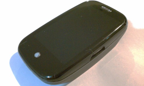
My Palm Pre

As you can see from the photo, physically, my Palm Pre hasn’t fared so well. I’m not gentlest owner – gadgets are meant to be used is my philosophy, but the Pre has fared much worse than my past few phones. Not only was plastic screen was a huge step back from the glass screened iPhones in terms of picking up random nicks and scratches, but in general, build quality left a a lot to be desired. Like all early Pres, mine suffered from light leakage (especially as it got warm) and a wobbly/not so nice feeling slider mechanism (the Palm Pre Plus is much better in that regard). In terms of wear and tear, the center button’s frosting/paint peeled off very early on. Hairline cracks developed at the corners seemingly of their own accord, and after flimsy USB/charger door finally snapped off, a huge crack started (continues?) growing on the side. Basically, it the hardware itself felt like it was on its last legs and over the past few months, really made me antsy about getting a new phone.

Last year, after giving up on AT&T and then spending a few weeks comparing an iPhone, Google Ion, and a Palm Pre, I went with the Palm Pre as my main phone. At the time, the Ion (HTC Sapphire) was running Cupcake, and for a variety reasons (no 3.5mm headjack, focus stealing bugs, and general UI wonkiness and incessant lag/chugging), really turned me off (I can still remember my disbelief how bad orientation changes were). In comparison, the Palm, while being the least mature, was obviously a better user experience.

Overall, I’ve continued to be a fan of Palm’s webOS, and it’s been a bit sad to see the lack of traction they’ve had in the market, especially considering how much of it they “do right.” That being said, it’s not exactly surprising. Besides some pretty huge strategic marketing and distribution missteps early on, there were/are a lot of technical/real reasons that it hasn’t been that successful.

First though, what Palm does right. I went to the Palm Developer Day for a variety of reasons: as a Pre owner/webOS developer (w/ interest in what was going on w/ the platform APIs, also a bone to pick w/ the state of their HTML5 support), a former developer event organizer (running Hack Days and such), and a long-time Palm fan (I had a USR Pilot! and I wanted to check out PalmHQ before they went out of business (or as it turns out, were acquired)). And… it turned out to be an awesome event. Just super-well done on every level.

I believe that what Ben, Dion, et al are doing w/ the Palm Developer community are spot on, and the APIs they’re rolling out are pretty exciting. As a web developer, the vision for webOS is pretty compelling, and the technology stack is pretty sweet. (The last talk of the day on the “secret” history of webOS by Rob Tsuk, was also pretty great, especially for anyone that’s poked around in the guts of webOS).

And of course, there have been plenty of people poking into the guts of webOS. One pleasant surprise, is that webOS has the cleanest/easiest to work with Linux I’ve seen on any phone (yes, it beats out OpenMoko). The second pleasant surprise is that Palm has been downright benevolent, nay, welcoming of the tinkering and hacking community (see also: WebOS Internals). There’s no “rooting” or “jailbreaking” and system modifications don’t require flashing ROMs, but rather with simple patches. In fact, since almost the beginning, there has been ipkg-based package management apps available (the current state of the art, Preware, makes all this downright civilized).

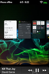
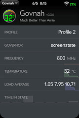
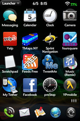
Because most of webOS is JavaScript based (basically, a WebKit/V8 instance sitting on top of Linux w/ a D-Bus service bus and some Java processes (being phased out)), there are many patches available that directly modify the system UI and included apps. I currently have almost two dozen patches, including those that change how the launcher is laid out, how the date and battery usage are displayed, text counting in the SMS app, how apps can be deleted, what the power button does. Just about any aspect of the system can be modified. (Heck, one guy, Jason Robitaille, has written tons of useful patches that have just made things so much more pleasant this past year. Thanks Jason!) The flip side, however is that the number of people that have installed these mods is almost certainly <1% of the installed base. Which isn't to say that there aren't things about the webOS that aren't inherently great. Both the notification system, and the "card" view for multitasking, are the best implementations of any mobile OS I've used. The UI is by and largely very well thought out. Unknown_2010-05-06_201514.png govnah_2010-05-06_202230.png govnah_2010-05-06_201502.png
However, even with all these pluses, there are issues that both have kept me from being very active in evangelism, and also leading to my recent switch. The rest of this post is critique. Since this is already too long, I’ll be moving to bullet points:

  • While Palm has a competitive platform, their hardware and overall rate of innovation is inadequate. At a friend’s suggestion, I loaded a CyanogenMod version of Donut on my Ion while on my Buenos Aires trip the end of last year. This was leaps and bounds better than Cupcake, and 2.1 and 2.2 are better still. What Android lacks in UI polish is made up for in performance, capabilities, and in sheer velocity, both of software and in the breakneck pace of newer and better hardware releases. Apple has been able to successfully fend off this relentless drumbeat thanks to its huge lead/install base and total UX superiority, however Palm obviously doesn’t have the former, and is hampered in the latter. Even still, come next week, Apple will have a next-generation hardware refresh that will bring it inline w/ current expectations (WVGA+ screen, HD capabilities), while Palm … just doesn’t.
  • webOS suffers doubly from not having any new hardware in sight because webOS is less optimized than Mobile OS X and Android, being both laggier and often running out of (and leaking) memory. It took probably half a year or so to get webOS to a good level. Even now, basic animations (CSS transforms) have yet to be GPU-enabled. And even after using an overclocked kernel (which clocks the OMAP3430 from 550MHz to 800MHz), my Pre suffers from enough intermittent performance issues (lag) to make me wish for something better (I actually like the keyboard and form-factor of the Pixi more than the Pre, but it’s even more under-powered)
  • Now admittedly, the worst of the issues has to do with the browser… all the WebView instances are actually shared, so when one runs out of memory, all of them end up getting kicked in the head (blanking out and reloading). Where this really hurts me is that webOS’s Google Maps app is really a WebView, not a “native” app. Beyond being grossly less featured than the Android or iPhone versions, it also inevitably loses state at the worst possible times while I’m navigating. I travel *a lot* and this has been one of the banes of my existence.
  • Speaking of the web browser, one of the other painful truths is that (ironically), webOS’s HTML5 support is worse than iPhone 3 and Android 2’s browsers. webOS is just using an ancient build of WebKit and it doesn’t have support for W3C Geolocation (good luck trying to use the NextMuni site), touch events, session storage, or web workers. ARGHULURHRHRHHH
  • There are a few other annoyances, like 2 minute boot-up times (I got an extended battery early on, which turned my Pre into a boat, but also meant that I almost never ran out of batteries unless I forgot to charge it, but I ended up rebooting a fair amount due to memory errors or other glitches – like with the radio or GPS), not being able to load things on boot (say launching the Govnah, or Brightness Unlinked, two must have homebrew apps) or not being able to upload to Flickr from the camera/gallery app (unfortunately, this couldn’t be implemented through the standard sharing framework because it required implementing account stuff through the palm bus, which won’t be available for developers until later this fall)
  • On the topic of APIs/software – having a recording API (again, coming by the fall) will open up whole classes of apps (voice recorders, Shazam/Sound Hound), but even with the APIs coming, there are still basic gaps (like a proper permissioning system, or stats/usage recording)…
  • I get it, it takes time to build – as a developer (and if I were primarily a mobile developer) this also makes it an exciting opportunity. With HP’s backing, presumably, webOS will continue to grow. However, as an end-user, it’s clear where the momentum is, and the apps/capabilities really speak for themselves. And I guess, more than any complaints about webOS specifically, it’s that it just that it just doesn’t fare well against the competition. I’m still avoiding the iPhone (mostly AT&T, a little bit customizability, a little bit principle), but even against Android… in terms of apps (now actually useful desktop widgets, offline news readers, wireless scanners, call analysis programs, SMS autoreply/scheduling, geofencing actions, Last.fm, Pandor, Slacker, Rdio, and Spotify, Shazam, and a host of navigation apps (including compasses, OSM offline maps, and Google Maps)) and hardware (touch focus camera, front-facing camera, microSD storage, etc, etc) there’s just no contest.
  • Competition is a good thing and I’ll be keeping tabs of what happens in the webOS world, but for now, I’m hopping on the Android train.

SXSW 2010 Recap

Better late than never!

Fav sessions from Interactive include:

“No Line” rule was in full effect during Interactive and served me well. The Drake, Ginger Man, and the Hilton were great post-party hangouts. A special shoutout for Datapop 2010 on the last night. Just tons of fun.

Now onto the Music…

  • Best Pre SXSW Music music – as mentioned above, Datapop 2010. A great chiptunes lineup, and the best crowd at SXSW:
  • Wished I caught them a second time – Washed Out
  • Best Showcase – Central Presbyterian Church on Wed night – I caught Balmorhea, and then skipped out on Zoe Keating and Volodja Balzalorsky, but dropped back in for Dustin O’Halloran and Hauschka, which was amazing. All in all, a huge change of pace and a great way to ease into SXSWm.
  • Criminally Empty – I caught the last of Sole set after Shearwater – granted, it was a busy Saturday night, way too much stuff going on, but only a like a dozen people showing up for Sole? Too bad, was a great set.
  • Hey I remember that band, cool – Little Brazil – I discovered them a couple years ago and was a big fan – a throwback indie/emo sound that was both super familiar, yet… actually good. When I saw they were playing, I had to catch them, and I was glad I did
  • Came through in the clutch – Estelle – I swung by for one reason only, to hear American Boy live. I asked at the door (a good habit) how late they were running and they said only a few minutes, but I started getting antsy as time dragged on – there’s always that sunk cost/can I get to another venue in time conundrum – in the end, they ran almost 30 minutes late w/ the soundcheck. I was in a pretty bad mood when Estelle finally came on… but surprise! She was a lot of fun and a great performer. Knowing how late they were running, would I have gone elsewhere? Probably. But at the same time, it was worth my while.
  • Longest Walk – this is a tie I think between trying to catch Seabear at Cafe Mundi (seriously far) – who ended up not playing at the time I thought they would be and was a bit of a cold windy bust, and catching Quantic spin a set at Malverde, which totally rocked.
  • Biggest Disappointment – Sleigh Bells – now mind you, I didn’t actually really hear them. The disappointment was that I tried to catch them twice – one at an impossibly long line at the NPR day show, and the second time at the Fader Fort – I rolled there just a few minutes too late – there was no line for the badge line, but they closed the venue as I was literally <20ft away walking up to the gate. Doh!
  • Best Random Day Show Act Discovery – I caught a bit of Body Language, who were fun and new to me, but I think passing by Lovejoy’s and hearing the Deleted Scenes playing at a DC day show was my best random discovery – I would have stayed and caught more than a song (apparently, some ex-Q and Not U guys played right after) but I was meeting up w/ a friend elsewhere.
  • Best Act I caught at SXSW – Nneka – caught her at the Day Stage and was just blown away, and went and caught bits of her and her band at Cedar St, and The Parish after. Good stuff.

Oh, the bonus “Best of” for this SXSWm was the SXXpress pass – basically SXSW’s equivalent of a Disneyland Fastpass. The caveat is that you have to try to drag yourself up and to the convention center at 10am. Still, I definitely approve.

Overall, I had tons of fun and let’s be honest, I’ll be back again next year.

Tax Day

Yeah, yeah, I wish it were simpler too – the mechanics of it are a pain in the ass, but that stuff we use has to come from somewhere. So, to celebrate, here’s a classic:

I AM AN AMERICAN CONSERVATIVE SHITHEEL

this morning I was awoken by my alarm clock powered by electricity generated by the public power monopoly regulated by the US department of energy. I then took a shower in the clean water provided by the municipal water utility. After that, I turned on the TV to one of the FCC regulated channels to see what the national weather service of the national oceanographic and atmospheric administration determined the weather was going to be like using satellites designed, built, and launched by the national aeronautics and space administration. I watched this while eating my breakfast of US department of agriculture inspected food and taking the drugs which have been determined as safe by the food and drug administration.

At the appropriate time as regulated by the US congress and kept accurate by the national institute of standards and technology and the US naval observatory, I get into my national highway traffic safety administration approved automobile and set out to work on the roads build by the local, state, and federal departments of transportation, possibly stopping to purchase additional fuel of a quality level determined by the environmental protection agency, using legal tender issued by the federal reserve bank. On the way out the door I deposit any mail I have to be sent out via the US postal service and drop the kids off at the public school.

After spending another day not being maimed or killed at work thanks to the workplace regulations imposed by the department of labor and the occupational safety and health administration, enjoying another two meals which again do not kill me because of the USDA, I drive my NHTSA car back home on the DOT roads, to my house which has not burned down in my absence because of the state and local building codes and fire marshal’s inspection, and which has not been plundered of all it’s valuables thanks to the local police department.

I then log on to the internet which was developed by the defense advanced research projects administration and post on freerepublic.com and fox news forums about how SOCIALISM in medicine is BAD because the government can’t do anything right.

Originally posted on the Laissez Faire forums at Something Awful.

…Now I Am The Master

From Apple’s 1984 commercial:

Today, we celebrate the first glorious anniversary of the Information Purification Directives. We have created, for the first time in all history, a garden of pure ideology, where each worker may bloom, secure from the pests purveying contradictory truths. Our Unification of Thoughts is more powerful a weapon than any fleet or army on earth. We are one people, with one will, one resolve, one cause. Our enemies shall talk themselves to death and we will bury them with their own confusion. We shall prevail!”

From Apple’s iPhone 4 SDK iPhone Developer Program License Agreement:

3.3.1 — Applications may only use Documented APIs in the manner prescribed by Apple and must not use or call any private APIs. Applications must be originally written in Objective-C, C, C++, or JavaScript as executed by the iPhone OS WebKit engine, and only code written in C, C++, and Objective-C may compile and directly link against the Documented APIs (e.g., Applications that link to Documented APIs through an intermediary translation or compatibility layer or tool are prohibited).

Some discussion at Boing Boing and Hacker News. (see also)

Hot Damn

Moving to a new server – 2.75TB of usable storage (quad core, 8GB RAM) and less expensive than my current one (an old Athlon64 X2 w/ 2G RAM I’ve had for.. 26 months). I stuck w/ NetDepot, who I’ve been super happy with for hosting.

Linux nd11544 2.6.31-16-server #53-Ubuntu SMP Tue Dec 8 05:08:02 UTC 2009 x86_64

To access official Ubuntu documentation, please visit:
http://help.ubuntu.com/

  System information as of Tue Dec 29 16:03:03 CST 2009

  System load:    0.0                Memory usage: 0%   Processes:       121
  Usage of /home: 0.0% of 784.65GB   Swap usage:   0%   Users logged in: 1

  Graph this data and manage this system at https://landscape.canonical.com/