Palm Pre Post-Mortem

Yesterday morning I went and picked up an HTC EVO 4G (post forthcoming). Like I did for my Iliad (inspired by Bunny’s exit reviews), here’s my (probably) last post on my Palm Pre (see earlier ones). This will be a bit long and rambly, and will be as much about the webOS platform as the device. You’ve been warned. 🙂

My Palm Pre

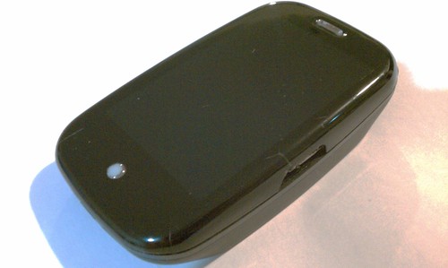
As you can see from the photo, physically, my Palm Pre hasn’t fared so well. I’m not gentlest owner – gadgets are meant to be used is my philosophy, but the Pre has fared much worse than my past few phones. Not only was plastic screen was a huge step back from the glass screened iPhones in terms of picking up random nicks and scratches, but in general, build quality left a a lot to be desired. Like all early Pres, mine suffered from light leakage (especially as it got warm) and a wobbly/not so nice feeling slider mechanism (the Palm Pre Plus is much better in that regard). In terms of wear and tear, the center button’s frosting/paint peeled off very early on. Hairline cracks developed at the corners seemingly of their own accord, and after flimsy USB/charger door finally snapped off, a huge crack started (continues?) growing on the side. Basically, it the hardware itself felt like it was on its last legs and over the past few months, really made me antsy about getting a new phone.

Last year, after giving up on AT&T and then spending a few weeks comparing an iPhone, Google Ion, and a Palm Pre, I went with the Palm Pre as my main phone. At the time, the Ion (HTC Sapphire) was running Cupcake, and for a variety reasons (no 3.5mm headjack, focus stealing bugs, and general UI wonkiness and incessant lag/chugging), really turned me off (I can still remember my disbelief how bad orientation changes were). In comparison, the Palm, while being the least mature, was obviously a better user experience.

Overall, I’ve continued to be a fan of Palm’s webOS, and it’s been a bit sad to see the lack of traction they’ve had in the market, especially considering how much of it they “do right.” That being said, it’s not exactly surprising. Besides some pretty huge strategic marketing and distribution missteps early on, there were/are a lot of technical/real reasons that it hasn’t been that successful.

First though, what Palm does right. I went to the Palm Developer Day for a variety of reasons: as a Pre owner/webOS developer (w/ interest in what was going on w/ the platform APIs, also a bone to pick w/ the state of their HTML5 support), a former developer event organizer (running Hack Days and such), and a long-time Palm fan (I had a USR Pilot! and I wanted to check out PalmHQ before they went out of business (or as it turns out, were acquired)). And… it turned out to be an awesome event. Just super-well done on every level.

I believe that what Ben, Dion, et al are doing w/ the Palm Developer community are spot on, and the APIs they’re rolling out are pretty exciting. As a web developer, the vision for webOS is pretty compelling, and the technology stack is pretty sweet. (The last talk of the day on the “secret” history of webOS by Rob Tsuk, was also pretty great, especially for anyone that’s poked around in the guts of webOS).

And of course, there have been plenty of people poking into the guts of webOS. One pleasant surprise, is that webOS has the cleanest/easiest to work with Linux I’ve seen on any phone (yes, it beats out OpenMoko). The second pleasant surprise is that Palm has been downright benevolent, nay, welcoming of the tinkering and hacking community (see also: WebOS Internals). There’s no “rooting” or “jailbreaking” and system modifications don’t require flashing ROMs, but rather with simple patches. In fact, since almost the beginning, there has been ipkg-based package management apps available (the current state of the art, Preware, makes all this downright civilized).

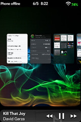
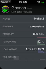
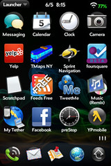
Because most of webOS is JavaScript based (basically, a WebKit/V8 instance sitting on top of Linux w/ a D-Bus service bus and some Java processes (being phased out)), there are many patches available that directly modify the system UI and included apps. I currently have almost two dozen patches, including those that change how the launcher is laid out, how the date and battery usage are displayed, text counting in the SMS app, how apps can be deleted, what the power button does. Just about any aspect of the system can be modified. (Heck, one guy, Jason Robitaille, has written tons of useful patches that have just made things so much more pleasant this past year. Thanks Jason!) The flip side, however is that the number of people that have installed these mods is almost certainly <1% of the installed base. Which isn't to say that there aren't things about the webOS that aren't inherently great. Both the notification system, and the "card" view for multitasking, are the best implementations of any mobile OS I've used. The UI is by and largely very well thought out. Unknown_2010-05-06_201514.png govnah_2010-05-06_202230.png govnah_2010-05-06_201502.png

However, even with all these pluses, there are issues that both have kept me from being very active in evangelism, and also leading to my recent switch. The rest of this post is critique. Since this is already too long, I’ll be moving to bullet points:

  • While Palm has a competitive platform, their hardware and overall rate of innovation is inadequate. At a friend’s suggestion, I loaded a CyanogenMod version of Donut on my Ion while on my Buenos Aires trip the end of last year. This was leaps and bounds better than Cupcake, and 2.1 and 2.2 are better still. What Android lacks in UI polish is made up for in performance, capabilities, and in sheer velocity, both of software and in the breakneck pace of newer and better hardware releases. Apple has been able to successfully fend off this relentless drumbeat thanks to its huge lead/install base and total UX superiority, however Palm obviously doesn’t have the former, and is hampered in the latter. Even still, come next week, Apple will have a next-generation hardware refresh that will bring it inline w/ current expectations (WVGA+ screen, HD capabilities), while Palm … just doesn’t.
  • webOS suffers doubly from not having any new hardware in sight because webOS is less optimized than Mobile OS X and Android, being both laggier and often running out of (and leaking) memory. It took probably half a year or so to get webOS to a good level. Even now, basic animations (CSS transforms) have yet to be GPU-enabled. And even after using an overclocked kernel (which clocks the OMAP3430 from 550MHz to 800MHz), my Pre suffers from enough intermittent performance issues (lag) to make me wish for something better (I actually like the keyboard and form-factor of the Pixi more than the Pre, but it’s even more under-powered)
  • Now admittedly, the worst of the issues has to do with the browser… all the WebView instances are actually shared, so when one runs out of memory, all of them end up getting kicked in the head (blanking out and reloading). Where this really hurts me is that webOS’s Google Maps app is really a WebView, not a “native” app. Beyond being grossly less featured than the Android or iPhone versions, it also inevitably loses state at the worst possible times while I’m navigating. I travel *a lot* and this has been one of the banes of my existence.
  • Speaking of the web browser, one of the other painful truths is that (ironically), webOS’s HTML5 support is worse than iPhone 3 and Android 2’s browsers. webOS is just using an ancient build of WebKit and it doesn’t have support for W3C Geolocation (good luck trying to use the NextMuni site), touch events, session storage, or web workers. ARGHULURHRHRHHH
  • There are a few other annoyances, like 2 minute boot-up times (I got an extended battery early on, which turned my Pre into a boat, but also meant that I almost never ran out of batteries unless I forgot to charge it, but I ended up rebooting a fair amount due to memory errors or other glitches – like with the radio or GPS), not being able to load things on boot (say launching the Govnah, or Brightness Unlinked, two must have homebrew apps) or not being able to upload to Flickr from the camera/gallery app (unfortunately, this couldn’t be implemented through the standard sharing framework because it required implementing account stuff through the palm bus, which won’t be available for developers until later this fall)
  • On the topic of APIs/software – having a recording API (again, coming by the fall) will open up whole classes of apps (voice recorders, Shazam/Sound Hound), but even with the APIs coming, there are still basic gaps (like a proper permissioning system, or stats/usage recording)…
  • I get it, it takes time to build – as a developer (and if I were primarily a mobile developer) this also makes it an exciting opportunity. With HP’s backing, presumably, webOS will continue to grow. However, as an end-user, it’s clear where the momentum is, and the apps/capabilities really speak for themselves. And I guess, more than any complaints about webOS specifically, it’s that it just that it just doesn’t fare well against the competition. I’m still avoiding the iPhone (mostly AT&T, a little bit customizability, a little bit principle), but even against Android… in terms of apps (now actually useful desktop widgets, offline news readers, wireless scanners, call analysis programs, SMS autoreply/scheduling, geofencing actions, Last.fm, Pandor, Slacker, Rdio, and Spotify, Shazam, and a host of navigation apps (including compasses, OSM offline maps, and Google Maps)) and hardware (touch focus camera, front-facing camera, microSD storage, etc, etc) there’s just no contest.
  • Competition is a good thing and I’ll be keeping tabs of what happens in the webOS world, but for now, I’m hopping on the Android train.

Palm Pre: Two Months In

I’ve been catching up recently on the Android switching (you can read the weeks where I tried out a Palm Pre, Google Ion, and iPhone 3G)… As for me, I ended up switching to a Palm Pre, and after taking it around the country for a two months as my primary device, I thought I’d give an update…

  • Reception – having carried the phone around in SF, LA, NY, Portland, and Boston, I’ve been extremely happy – it’s an amazingly huge improvement over my AT&T service- my only dropped calls happen with friends on AT&T, and the data connection is very good – I even get data underground on BART throughout SF.
  • Voice Mail – I’ve remembered how much I hate voice mail. I have Google Voice… my initial reading seemed to be that call-forwarding for Sprint was an all or nothing proposition, but there might be some options for that… I’ll be trying to get that setup (even at 20 cents per minute, it’d be worth it to not have to listen to VMs).
  • Maps – my original hope was that the GMaps app would be decent, but really it’s pretty pathetic. It’s worse than the Android version, and far inferior to Apple’s Map application. It’s been a bit surprising to me how much better Apple’s implementation is (they write their own app, they just use Google’s tiles). You’d think that Google would be able to do a better job. On the other hand, I’ve found myself using TeleNav’s Sprint Navigation app more and more – it’s not ideal, as it’s hard to get out of turn-by-turn mode (I often find myself wanting to see the next turn) and sometimes it loses (or just won’t acquire) a GPS fix, but I’ve been a lot happier with its behavior in general (no problems w/ map tiles, or forgetting what it’s doing – it also has a history and interacts with my contacts) – it is however pretty battery intensive and takes a while to load up
  • Battery Life – this was my biggest complain when I first got my Pre. And for the first month it remained a huge problem – it just couldn’t last a day, which since I’m not office bound, means lasting at least from say 10am until 3am – even when I didn’t make any calls or even wake it, it’d run itself down just from its syncing. This was improved somewhat by the 1.1 update, but the main reason that it’s no longer a complaint is that I bought an extended battery – this thing adds an extra 5mm (it looks and feels like a lot more) of depth, and makes my Pre creak like no tomorrow, but it also comfortably gives me over a day no matter how much I use it (it seems to last just under 2 days in regular usage). If you’re getting a Pre, I’d say you pretty much are going to want to get either a spare battery or an extended battery.
  • Performance – My new top annoyance is now the intermittent lag/lack of responsiveness with the phone. When it’s working well, it’s really quite nice, but I find the Pre lagging out quite a bit. The dialer and autocomplete are particularly bad (not to mention that the autocomplete doesn’t have any sort of learning algorithm – no matter how many times you send to an address, you’ll never have to type less letters and it’ll never move up). Apps that have listings are also quite slow – i.e., while the 1.1 update sped up photo rendering, when you jump into the photos from the camera, it takes you to the folder list, which renders incredibly slowly. The same thing holds true for listing MP3s when jumping into the music app. But it’s not just limited to that – sometimes the launcher lags out, or app launching, or any number of things. I can’t explain why these things aren’t cached or why responsiveness isn’t made a higher priority. My biggest gripe is that when the phone lags out, it isn’t just a rendering issue, all response just grinds to a halt. I haven’t tested whether reboots do much w/ performance, but since despite using Upstart, the Pre still takes almost 2 minutes to boot (what’s up w/ that? when Ubuntu boots in 10s, I’m not sure what excuse the Pre, running on a fixed hardware platform, really has)
  • Copy and Paste – oh the irony. The iPhone now has superb copy and paste support, and it turns out that the Pre’s copy and paste is completely useless – time and time again I need to copy something from an email, web page, or text message. And I can’t! Also, the few times I can, only serves to show how awkward Palms copy and paste command/gestures are.
  • Other UI – It’s not all bad though – I remain impressed w/ the cards implementation, and the notifications just plain rock. Every time an alarm goes off, or something else pops up and I can keep typing through what I was working on, I get a nice warm fuzzy feeling. This is how it’s supposed to work people!
  • Apps – The official app store remains pretty anemic – I find myself missing some apps, like a decent Yelp app (Where is pretty substandard) or a Midori/Shazam equivalent, but the homebrew scene has been just plain making me happy. There are hundreds of homebrew apps that have been filling in the gaps (include a homebrew app “store”, scientific calculator, timers/stopwatches, a terminal, and yes, a great tethering app).
  • Headset/Microphone – one thing that is maybe a bit esoteric for some, but is actually up there with my biggest niggles, as I use this all the time is that there are some strange things with how the Pre interacts with my wired headsets. I use Ultimate Buds as my primary headset. They’re great for music and they conveniently have a remote and microphone – which the Palm Pre actually supports, with both the single click play/pause, and the double-click next track. That’s great! Unfortunately, after pausing for 5 seconds, the Pre “goes to sleep” and stops responding to the TRRS signal – to unpause, you’ll need to hit the power button or otherwise wake it before it’ll respond again. This is took a while to figure out, and is somewhat maddening – it also makes pausing somewhat useless and makes me wonder if anyone bothered to test this feature. The second big annoyance is that unlike the iPhone, which gives no microphone feedback, the Palm Pre gives you lots of microphone feedback – in fact, much more feedback than the other side of the line receives – so much so that it becomes impossible to hear the other side when there’s even moderate wind or traffic noise. This doesn’t happen without the headset and is downright retarded.

Now, while the list looks a bit weighted towards complaints, and while there are definitely some issues that well… verge on total brokenness (I’ve submitted the worst problems to Palm), most of these issues seem like they can be fixed via software updates, and on a day-to-day level, I’ve been mostly satisfied with my Pre.

The experience is absolutely not as good as the iPhone, but I guess at the end of the day, it’s still much more usable than the Android, and for me, it’s worth supporting an alternative because well, despite Schiller’s outreach, the the App Store really is abominable, not just in its practice/actuality, but also, after having given it some thought, and reflecting on its implications, as a general model.

Mobile devices are the next generation general computing/network access platform and having a device manufacturer as a post-facto gatekeeper is just not right. Getting rid of end-to-end not only reverses the freedoms that spawned the innovation on the Internet, but also creates a bottleneck on software development/distribution that I’ve never seen in modern general computing…

Oh, also: AT&T can suck it.

Thoughts on the Palm Pre, G2, and iPhone 3G

Last week, I ended up with a Google Ion and a Palm Pre. I also loaded up the 3.0GM on the iPhone 3G. With active service on all of these and a whole bunch of devices on hand, I’ll be writing up some of my opinions in depth here. Instead of spamming multiple posts, I’ll just keep adding to this page (people on feed readers may want to check back in a week).

This isn’t necessarily intended as a full review, although if you’re primary question is whether the G2 or Pre are better than the iPhone, the answer is basically no. Android is very interesting from a developer perspective, and the G2 isn’t horrible, but it has many UI shortcomings that would make me sad if I had to carry it around as my daily device. The Pre on the other hand, is something I’d carry around (and in fact I’ll be switching to it as my primary phone), but in most regards for most people it is not better than iPhone 3.0 (OS features, responsiveness, battery life, applications). Which isn’t to say it’s much worse, but that if I were to give a recommendation, all other things being equal, I’d recommend someone go w/ a 3GS over a Pre. Given that statement, why am I switching? Here are my reasons (they may or may not apply to you):

  • In the cities I frequent (SF, LA, NYC), AT&T reception has been getting increasingly worse – a good quarter of my calls drop in SF, especially when I head downtown, and this past LA trip racked up a good 50% call failure rate across West LA, Culver City, Downtown, and Arcadia (this I’m sure is exacerbated when both ends are on iPhones). In comparison, on calls I’ve made this week w/ the G2 (T-Mobile) and Pre (Sprint), I’ve had no dropped calls at the same locations. Also, 3G data just doesn’t work in downtown SF and it seems, anytime there are lots of iPhones in an area. This is a problem that seems to be common enough, but as AT&T seems to not be acknowledging these problems and is unable or unwilling to fix them, and with the introduction of both more desirable and cheaper iPhones, I can only surmise that this will get worse. (somewhat related to that, I’ll also be saving $15/mo on my bill ($360 over 24 months), which is a pleasant bonus.)
  • I’ll be dedicating a post to this soon, but my moral outrage at Apple’s App approval process has been pretty palpable – it literally revulses me when I think too hard about it, and it’s managed to burn off a lot of the good will and regard that I feel for Apple over the past few months (not as much as when I had to admin a labful of OS9 Macs <tic> but…) Calling it evil is I think pretty accurate. This behavior is enabled by the fact that the iPhone is currently the only game in town for mobile developers. I think that everyone (including, in the long term, Apple) would benefit if this weren’t the case.
  • The Pre surpasses the minimum bar of general usability I have and there are some aspects of the Pre that are noticeably superior to the iPhone. I mentioned a couple things in an earlier post like the quick camera and the unified inbox. Others include the way notifications work, which is non-modal and doesn’t steal focus (NOTE to Android PMs [I address this to the PMs because it’s clear there must not be any UI designers with any say whatsoever]) and the thoughtful ways to go into airplane mode (as an option on power-off and in the menu when tapping on the upper right).
  • This is a biggie for me, but if you are also into poking around on your phone, the Pre is the most hacker friendly phone I’ve ever seen (yes, much more-so than open phones like the Android or OpenMoko, as you can easily modify the UI directly (since the apps are in JS) instead of having to recompile GTK/Java-based apps or flash hacked firmwares). With an unencrypted and very clean embedded Linux OS w/ a standard layout and easy root access (bonus style points for the use of the Konami code to enable it), I have a feeling we’ll be seeing lots really interesting stuff coming out of the homebrew scene soon. Even better, the initial Palm response to this hacking has been benign, if not outright friendly. This is the right way to build up developer good will. Here’s my sandbox for poking around on that (and for projects that are outside the scope of the Mojo SDK).

The biggest caveat for those considering the Pre right now is the battery-life. For me, it’ll last for about 8-12 hours under very light usage, which is OK, but the bad part is that unlike my iPhone, the Pre sucks battery life at an alarmingly regular rate while idling. Whereas I can leave my iPhone unplugged overnight and maybe see a 1/4-1/3 drop, doing that w/ the Pre will leave you with a dead phone. The battery is still new, so it might get better with conditioning and I’ve heard that there’s an update that might be released soon to help address the battery issues, but as of right now… it’s an issue.

OK, so with that out of the way, here’s where I start nitpicking through things…

Physical Design

Both the G2 and the Pre are smaller (but thicker) than the iPhone. They both feel a bit lighter than the iPhone (the glass screen on the iPhone gives it a lot of that heft), but all three feel pretty good in the hand (it’s tossup between the G2 which is the least wide and fits better in my hand and the Pre which is overall rounder).

The G2 has only one connector a combination mini-USB/custom HTC adapter on the bottom (no 3.5mm headphone jack; there wasn’t an adapter in my box – I assume the retail versions will have one, but it’s still rather ridiculous) and a volume rocker on the side. On the front, there’s a trackball and 6 buttons (home, menu, back, search, call, and end/power). There are two LEDs on each side of the earpiece speaker near the top – they don’t seem to blink for notifications, just when charging or low on battery.

The lack of a hardware ringer switch is one of my pet peeves. In fact, with the G2, there’s actually no way to go into silent or vibrate mode without pulling it out of your pocket and unlocking the phone and then silencing it, as the volume keys are locked and don’t do anything otherwise. Personally, I consider this a pretty big minus, as the ability to easily go into and confirm that you’re in silent mode without pulling your phone out is something that I use all the time (meetings, movies, anywhere you’re around company and trying to be inconspicuous).

When closed, the Pre’s button layout pretty much matches the iPhone’s. The ringer switch is there of course (with a [too weak] vibrate to confirm), and the power button is on the top-left corner, which is convenient for handling calls (one click to dismiss, two to send to voice mail). My big nitpick for the buttons is that while like the iPhone, the two-step wake process involves a button-click and a gesture, in this case, the center-button doesn’t work, just the power button. Now, this may just be muscle memory (and I can to some degree understand why the center button doesn’t wake, as it protrudes as opposed to the iPhone’s better designed recessed center button), but, and this has happened a fair number of times, the power button is almost inaccessible when the slider is open, making waking/unlocking a complete pain in the ass when it’s open. It can be woken also by use of the slider, but…

The slider is another point where I’m not entirely happy with. Because of the Pre’s shape and surface, I’ve found it almost impossible to open single-handed (and sometimes difficult even with two hands). No one I’ve handed the phone to has had an easy time with it (or typically, even figuring out the sliding w/o prompting). I’ve just slapped on some Ghost Armor on, which actually seems to add just enough grip to make this significantly easier. I assume that the Touchstone back, w/ it’s soft-touch back would also make a big difference in that regard.

One thing that I mentioned earlier that I’m incredibly happy with is the Pre’s TRRS support on its 3.5mm jack – that means all your iPhone headsets will work (including the mic and the remote). I’ve noticed that there are sometimes issues with unpausing with the clicker, but as it seems to work flawlessly with the Pandora app, I’m going to chalk it up to Palm’s Music app, which is to put it charitably, a bit flaky.

Battery

While the battery-life of my iPhone was a definite step down from my Blackberry, in general use, both my original and my 3G have proved to be solid performers, generally managing to provide a full day (and more importantly, night’s) worth of charge. Under duress (conferences, etc.), the ubiquity of external batteries/standalone chargers has helped ameliorate those problems and the latest generation of case/battery combos are downright sexy. It’s funny to think that a couple years ago, a non-removable battery was a big deal, but now, it just isn’t…

The Pre seems to have been conceived prior to that point. Yes, the battery is removable. But the flip side of having a battery that doesn’t last through the day… I’m not sure that’s quite the selling point they were hoping for. There’s apparently a 1350mAh third party replacement battery (same form factor), which is a start, but I think there will need to be some software tweaking that focuses on some smart and aggressive power management to really fix this problem. (It’s by far the biggest weakness of the Pre I’ve found so far).

The G2 on the other hand has been a pleasant surprise (especially w/ the issues the G1 has had) and seems to have great battery life. Even during the first day with very heavy downloading (installing dozens of apps, poking around into everything) it had no problem making it through the day.

Keyboard

I type a lot on my phones (and have since getting my first Treo 600 and my original Danger Hiptop) and prefer QWERTY keyboards (I’ve switched back and forth between portrait and landscape, and now virtual vs physical). The keyboard on the Pre is pretty good (and laid out properly, w/ the @ and period on either side of the space) – I have no problems typing on it and the accuracy is much better than on the iPhone keyboard. That being said, I’m not sure it’s a huge speed boost and I find myself missing the corrections and the emoji international keyboards. The Android software keyboard on the G2 is also quite good, however, entering keyboard mode is sometimes awkward. Like the rest of the Android UI, there’s a certain lack of UI polish as things get pushed off (sometimes hidden) off-screen when the keyboard activates, but overall the Android keyboard worked surprisingly well.

Before I got the iPhone, I was as skeptical as anyone about the virtual keyboard, however after using it for a couple years, I’m now rather agnostic about it. What’s clear though is that the virtual keyboard has a huge advantage in flexibility, like the iPhone’s world class internationalization or for the still-as-of-yet largely untapped custom/app/domain-specific keyboard layouts.

OS Look and Feel

In my eyes, webOS is the first competitor to finally step up to the iPhone’s challenge in terms of presenting a well-thought out and genuinely delightful interface. It’s been interesting to watch this play out over the past couple years – not only did Apple catch the mobile manufacturers flat-footed, but we got to watch, Keystone Cops style as the various players tried to catch up, mostly pushing out half-baked, cargo cult touchscreen implementations that seemed to have missed most of the point.

The Pre’s general responsiveness is good – it’s gotten some dings on app-loading time, but it seems no worse (and sometimes much better) than responsiveness on my iPhone. One thing that the iPhone does much better for app-loading however is with affordances – the iPhone has a built in “zoom” that not only gives a 1s mask for the app, but also instantly lets the user know that the user was successful in launching, even if they are subsequently greeted with a blank screen, although the Mobile HIG gives recommendations (and the SDK code samples) for storing an app image snapshot. Android actually does this decently – apps seem to load much faster by default, but there is a swipe animation and a title bar replacement that gives you instant feedback on launching.

Another area where the iPhone still beats both the Pre and G2 is in responsiveness of the “desktop” – its combination of software physics and the physical surface feels just right (it may be an illusion, but 3.0 feels even zippier than 2.x) – very quick and responsive, super-slick, never laggy. The Pre is a close second – there is occasional lag with the launcher and it’s just a hair slower – and the plastic surface is surprisingly good. It really only suffers when you do a head-by-head comparison with the iPhone (so smooth…).

The G2 is (you might be beginning to notice a theme developing from here on out) far behind. The screen is supposed to be capacitive, but is laggier and draggier than the Pre, and doesn’t support multitouch. It doesn’t have any sort of physics at all, which, while boring is actually the least serious of my complaints. My biggest ire is reserved for the wonkiness of the drag/click interactions. The notifications bar (which is non-modal but which steals the focus from what you’re doing when there’s a new notification – STAB STAB STAB) seems to fill up quite quickly, but requires a flick with a certain distance/acceleration to pull down to dismiss (they can only be cleared en-masse). On the bottom, there’s a tab for the (alphabetically ordered only) launcher that reacts similarly, but also can be clicked to expand. This is complicated of course by the fact that if you don’t click exactly, it registers as a drag and you get a useless 2px animated move. Which fresh-from Stanford grad thought that one up? Even worse, this same tab is used elsewhere in the interface (like in the dialer) but doesn’t respond to clicks at all – you’re left to wonder if you accidentally dragged until you realize that in this interface the exact same looking tab is drag-only and doesn’t respond to clicks at all. Thanks!

The most interesting bit of the Android desktop, the three-pane “desktop” unfortunately suffers from the fact that there is currently only one really great widget (the lock2’s Weather Widget) – I mean really, what am I going to do with a Twitter widget that shows the last (yes as in single) tweet from my stream? I ended up (over) filling up the rest of the desktop with icons of the apps I wanted to use in a sensible/findable organization. To add insult to injury, the desktop often slows down (or disappears completely!), even though it’s… pretty useless.

(On the desktop note, it’s unfortunate that the Pre like the iPhone doesn’t allow any way of customizing the lock screen or the “desktop” (which is empty when there are no cards) w/ a Dashboard or Today style screen – this is something that BB and WinMo have had forever, and something that the N97 (and future Android phones) are on the right track with.)

More scorn needs to be heaped on the G2 for it’s accelerometer – instead of having a regular rotation like any normal implementation, it instead darkens and blurs your screen (rendering it illegible) for a good second or two before flipping it. This makes every single accidental flip that much more annoying – if you find yourself forced to use a G2, do yourself a favor and go to Settings -> Display -> Orientation to turn that off. It’s that badly done. The Pre’s accelerometer behavior in contrast is quite impressive – both zippier and less touchy than my iPhone’s.

A note on boot times. The iPhone takes about 1m45s to boot up. The Pre is just a hair worse, about 1m55s. The G2 does better at about 1m05s – 1m15s (the fudge is because the launcher is a bit stuttery as widgets and other things initialize).

Search

While Palm has made a big deal of their “Universal Search” and the idea of “just typing” if you’re stuck, it turns out that iPhone 3.0’s search is actually better – not only slightly quicker and more responsive, but also more comprehensive. Apple’s search indexes notes, calendar items, and emails among other things (none of which webOS does currently). Here’s hoping Palm can follow through with their search framework.

One other thing to note is that there doesn’t appear to be any type of adaptive ranking mechanism for searches on the Pre. That is, no matter how many times you pick the “Flickr” contact when sending emails, it’ll never rise up in the results list right now. This is a major drag and something that the iPhone has done since launch.

Email

One of the things that the Pre blows away the iPhone on is handling multiple accounts. As I mentioned in my earlier article, right now, if there were new mail, we’re talking about 4 clicks to check mail for each account. 2 clicks just to get to the top level to check which account new mail has come into… It’s a right mess. The search in 3.0 is a welcome addition, although it looks like you can either do a global search in the main search interface (click the home button twice) or search within a folder when you’re in the Mail app.

Strangely enough, the Pre handles my GMail accounts (one GMail, four GMail for domains) better than the G2 – Android has a special “GMail” app that can only connect to the single “primary” Google account you hook your Android up to (this connects the Contacts and Calendar as well), but then you’re forced to use a separate “EMail” app for everything else. This is… stupid. It also is kludgy and not very pleasant. Overall, I’m much happier w/ how the Pre handles things. Setup is a little weird (you have to wait for it to fail automatically connecting before you getting a chance to manually change the settings), but after things are humming, it’s generally pleasant (with IMAP IDLE support). There are currently some EAS issues being worked out apparently, but I don’t have to deal w/ Exchange so that doesn’t impact me. One annoyance w/ Palm’s new email notifications is that a clicking through takes you into the message, but backing out takes you to the message’s Inbox, not the unified inbox. It’d be nice to control the default view there, and it seems there might be a better way of navigating (a drop down where the title/header bar is?), but it’s not a bad start.

Maps

There’s barely a day that goes by (well, those days I guess when I don’t step out the door) where I haven’t my iPhone’s Map application. If minutes were logged for application usage (that’d be nice, actually), I’d guess that it’d be by far the number one app. As such, I’m rather sensitive to its various foibles (somewhat stingy caching, the extra clicks for routing/re-routing from the current location, lack of reverse chronological listing of searches or the ability to juggle multiple points) and had high expectations for these other phones, especially Android.

Unfortunately, both the Pre and G2 fall short. The Pre’s GMaps are functional, but it seems to be a pure web-app (head to maps.google.com w/ the TeleNav, the same guys that developed the AT&T Navigator now available for the iPhone. The nice thing is that this comes free on the Pre (it’s a $10/mo extra on the iPhone) and it actually works pretty well (including integration w/ the address book). The speaker voice is a bit hard to hear, and it absolutely kills battery life (I couldn’t find a way to pause it or put in in the background while you have a route input), but it’s pretty neat if you drive a lot (the updating ETA is quite nice).

Browser

All three are WebKit-based browsers. You wouldn’t expect that much difference, so the big surprise for me was how horrible the Android browser is – it’s pretty much unusable. It doesn’t zoom well at all, so pretty much all layouts go off the screen, and it doesn’t support double-clicking to zoom to a DIV or reformat, so you’re forced to use the fixed zoom buttons (no pinch and spread of course). I was pretty shocked. It’s also the only one of the browsers to not support HTML5 data storage (it has support Gears storage instead – what a pain). The iPhone 3.0 browser is currently the only one of those browsers to support W3C geolocation (which Safari 4 and Firefox 3.5 both support).

The Pre browser has been fine – pretty zippy (slightly faster than 3.0 on the 3G, although that may be network dependent), with only a few rough edges (lack of zoom for field inputs, YouTube embeds don’t link to the YouTube app, and it doesn’t lock dragging, presumably because of the Apple patent). The only real rendering issues I have is with the iPhone version of Google Reader – it seems to occasionally get lost in the page when expanding some of the articles. There’s probably some weird height calculation/scrolling issues going on or something…

Photos

App Store

Development
Couple of New Toys: Google Ion (G2) and Palm Pre

It’s been a busy couple months of intense traveling and juggling way too many projects, but I’m happy to report that I’m beginning to cull both of those to a somewhat manageable level.

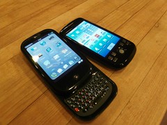
New ToysIn the meantime, this past week I’ve picked up a couple new toys. A Google Ion (aka HTC Magic aka T-Mobile myTouch 3G (really T-Mobile?)) that I got care of Bradley Horowitz (I’ve started a GitHub project to at least have some sort of accountability there) and a Palm Pre that I just picked up today.

I figure that since I’ve been using an iPhone (original and then a 3G) for the past couple years and I have active service on all the devices at the moment, I’ll do an iPhone 3G vs Google Ion vs Palm Pre shoot-out after I get a chance playing with the latter a bit more (weekend project?).

There’s a lot I’ve been meaning to post about, so this blog will probably be very mobile-heavy over the next few weeks… In the meantime, some notes:

  • Android has by far the most impressive SDK – the kind of apps that you can do with full phone access are just leaps and bounds beyond what you can do with either the iPhone SDK or with the Mojo SDK. The latter I’m bound by NDA on, but there’s enough public stuff to talk about. I’ll be doing a post soon (also where I’ll rant at length about Apple’s app approval process, and talk about marketshare). That being said, having played w/ almost 20 Android transit apps, I got to say, there’s definitely a real big gap there.
  • I’ve only seen one report of it, which I find rather amazing considering the number of reviews I’ve read, but the Palm Pre does indeed support have TRRS connector support, which include supporting the microphone as well as clicking for answering, pausing, and double-clicking for the next track. This works not just for the music player, but also for Pandora (and presumably other third party apps using the WebOS audio services/media extensions. This rocks, as I have a few hundred bucks worth of Ultimate Buds and am unconvinced on the audio quality that AD2P/AVRCP controllers like the Jabra BT3030 offer (not to mention the battery life issues both for the controller and the phone).
  • The Google Ion has a much better image quality (with auto-focus), but the Palm Pre gets props for both having the fastest shot-to-shot (and the least shutter lag) of any camera phone I’ve ever used. It’s actually faster than my Samsung point and shoot. And since you can leave it open in a card (the live display gets paused) where switching is almost instantaneous, I expect to have a lot less missed shots when spontaneous antics occur. Hopefully it’ll do video as well as it does stills…

  • OCD-leaning people beware, these phones are fingerprint magnets. Amazingly, the Ion and the Pre are both worse than the iPhone in that regard. They both have decent hand-feel, with the Ion fitting a bit better in my hand (a little longer, but less wide). Maybe I just haven’t figure out out the slider yet, but that’s probably the most awkward thing for me right now – there’s just nothing to push against to open it. Oh, also, prying off the micro-USB cap took a real leap of faith. I can see how people have snapped it right off. That’s basically what it feels like.
  • One software note (many more forthcoming) – is that I’m really digging the Pre Mail app’s combined inbox. IMAP IDLE w/ Gmail accounts works great, even better than on Android, which only supports a single GMail account (with everything else in a separate Email app). While I wish there were some improvements (like coloring or some other way of marking which email was going to what account) and it’s nowhere near as mature as the Blackberry inbox, this is still a huge improvement over email on my iPhone – w/ 7 email accounts, it takes 2 clicks to look at my accounts and 4 clicks to get in and out of each inbox (28 clicks total if I have new mail in each account).

Feel free to leave any specific questions and I’ll try to answer, I’m planning on doing a comparison w/ timings and end-user notes as well as one specifically on development and other thoughts. I’ll try to not get too obsessed, since there’s lots of actual work that I really should be doing instead, but at the same time, I have a fair amount to say, and I’ve used just about every smart-phone platform at one time or another and have a decent number of current OS’s to compare these to (I should probably dig out an old Treo and an N-Series to complete the set).